In my last post I outlined how the amounts of fertilizer applied to my golf course has changed over the years due to adopting the MLSN guidelines. In this post I will show some cool animated charts that show how the way I fertilize has changed as I adopted the growth potential model. Special thanks for Micah Woods for making these cool animated charts with my data. Refresh the page if the animation doesn't repeat.
This first chart shows the monthly nitrogen applications to my greens side by side going back until 2008. As you can see, as time goes on the rates get lower but they also get more consistent with less big spikes. Looking back 8 years I can't help but wonder what I was thinking! It is really too bad that I don't have growth rate data going back more than a few years.

You can see that in early 2012 I was on a similar track to what I would normally be on. That was until I came across this article about using growth potential to determine nitrogen rates based on temperature by Micah Woods from 2012. I started using growth potential in late 2012 but didn't get into a good groove until 2014. This was because in 2012 I was just starting out and in 2013 I had to add more fertilizer to help my greens recover from winter damage. Since then I have lost very little grass and fertilizing has been business as usual with no major variances from the growth potential model.
The next animation shows the same thing as the last one except the monthly amounts are transposed on top of each other so that you can more easily compare how the rates per month changed.

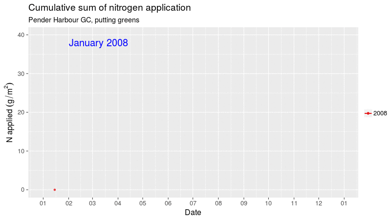
The chart below shows the cumulative amount of nitrogen applied to my greens over the years. As you can see, my total annual nitrogen rates are where I used to be at in May! This has had a big impact on thatch as well as the amount that we need to mow our greens in the spring. It has also helped us get a better quality of cut during the poa seed head flush each spring.

Thanks again to Micah for making these charts with my data. I find it interesting to look back at what I have done and to compare it like this.
Next up is to try and figure out what changes if any I plant to make for my fertilizer practices in 2017!
This first chart shows the monthly nitrogen applications to my greens side by side going back until 2008. As you can see, as time goes on the rates get lower but they also get more consistent with less big spikes. Looking back 8 years I can't help but wonder what I was thinking! It is really too bad that I don't have growth rate data going back more than a few years.

You can see that in early 2012 I was on a similar track to what I would normally be on. That was until I came across this article about using growth potential to determine nitrogen rates based on temperature by Micah Woods from 2012. I started using growth potential in late 2012 but didn't get into a good groove until 2014. This was because in 2012 I was just starting out and in 2013 I had to add more fertilizer to help my greens recover from winter damage. Since then I have lost very little grass and fertilizing has been business as usual with no major variances from the growth potential model.
The next animation shows the same thing as the last one except the monthly amounts are transposed on top of each other so that you can more easily compare how the rates per month changed.

The chart below shows the cumulative amount of nitrogen applied to my greens over the years. As you can see, my total annual nitrogen rates are where I used to be at in May! This has had a big impact on thatch as well as the amount that we need to mow our greens in the spring. It has also helped us get a better quality of cut during the poa seed head flush each spring.
Thanks again to Micah for making these charts with my data. I find it interesting to look back at what I have done and to compare it like this.
Next up is to try and figure out what changes if any I plant to make for my fertilizer practices in 2017!